

our identity
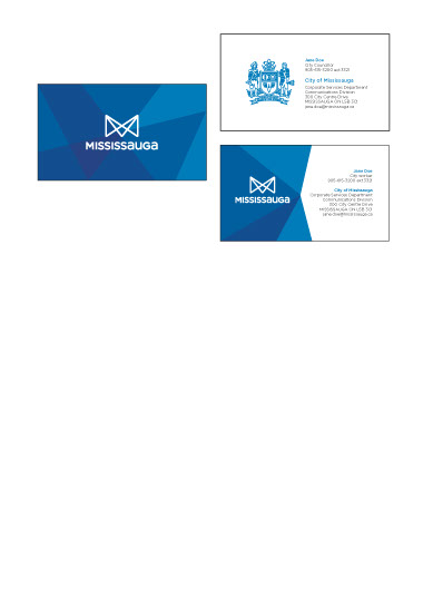
Mississauga’s brand expression comes to life in its new identity system. Its versatile colour palette echoes our rich diversity. The custom typography adds both warmth and distinction.
celebrating
our brand with colours
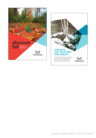
Although there are predefined colour system;
the colour palette will be flexible enough to complement the imagery.
a flexible
design system
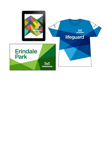
Multiple colour facets and shades reflect our communities and our vibrancy. This approach
will allow more playfulness and flexibility to
the brand.
a bold
downtown
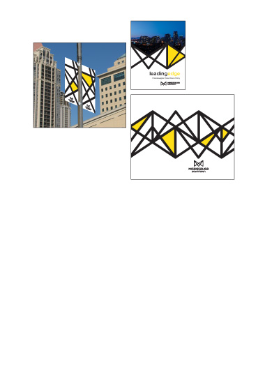
Every downtown needs to be bold. This design allows us just that but at the same time stays aligned to our brand by focusing on the lines
rather than the fills we can talk about our vision
for a Mississauga downtown.


